ReactJS Data Visualization Libraries in a Hack Night
Prerequisites
- react
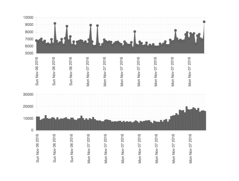
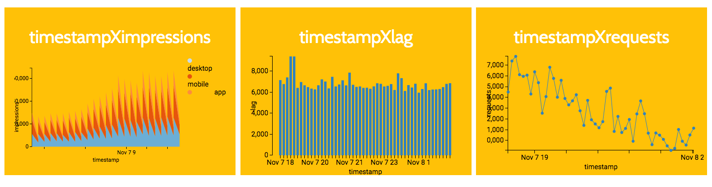
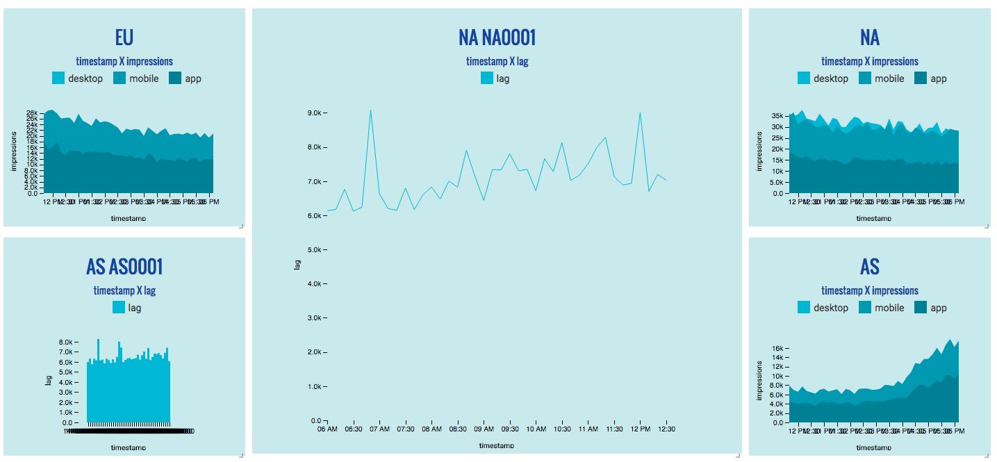
At the hackathon last night, we were given a bunch of advertising data to work with so that data can be more understandable. I experimented with several React data visualization libraries, out of which I couldn't really find a perfect one. I will share the experience working with the libraries, and what pros and cons I found.
All versions of implementation and final demo can be found here.
Basically, below is just some subjective observations in a hack night, so there may be many mistakes in the description. I do appreciate any corrections!
react-chartjs
The main problem is in its documentation, which seems to be fancy but are actually including too many information which is loosely distributed throughout the entire doc.
Especially the options, which determines the settings, style, scale, and all other important stuffs, are really messy and not working as expected. I searched through many examples but simply cannot get rid of the gray color in my chart. Discarded it because nobody wants such a chart with not-very-appealing look.
But I really like that I can work out a formatted x-axis display value. This should be a basic functionality, but surprisingly not many libraries get this well.
Data Parsing
Use labels as x-axis or categories, data in datasets as y-axis or values.
var chartData = {
    datasets: [{
        data: [45, 25, 20, 10],
        // other options
    }],
    labels: ['Red', 'Blue', 'Purple', 'Yellow']
};
Pros
- Use
labelsto represent x-axis, which is great that I can customize
Cons
- Not providing a clear react version documentation but uses chartjs's instead, which I don't really like because of the extensive information
- Demonstration page not clear with how the data look like
- Don't know why, but some of the
optionsare not working, and I can't do the styling because of this
react-d3
The main problem is in data parsing.
You need to go through the whole data and explicitly parse out the x and y in a values array, which is most commonly done by simply setting the field key in other libraries. This can be helpful if you want even more flexibility, but this is seldom the case.
And again, where can I easily find the styling instructions? Miserable.
Data Parsing
Parse points as x-y pairs in a values array for coordinate charts.
Parse categories as label and values as value for category charts.
var lineData = [
  {
    name: "series1",
    values: [ { x: 0, y: 20 }, ..., { x: 24, y: 10 } ],
    strokeWidth: 3,
    strokeDashArray: "5,5",
  },
  ....
  {
    name: "series2",
    values: [ { x: 70, y: 82 }, ..., { x: 76, y: 82 } ]
  }
];
var pieData = [
  {label: 'Margarita', value: 20.0},
  {label: 'John', value: 55.0},
  {label: 'Tim', value: 25.0 }
];
Pros
- Nice demonstration page, simple and clear
- Parse the x/y coordinates ourselves, which can be more flexible (but also a con)
Cons
- The styling instructions are somehow hidden deep in the documentation
- Need to parse the x/y coordinates ourselves, which is more tedious (but also a pro)
- Customize displayed x-/y-axis is not flexible enough (only found time on x-axis to be formattable, but the instructions are not clear)
react-d3-basic
To be honest, I choose this as the final working version simply because I KNOW HOW TO STYLE IT. The documentation is the nice ever.
The main problem is still in data parsing and non-customizable x-axis display value.
Although the doc is nice, but the data are not especially shown, so I have to look for the .csv files on github and found some missing. Not a big problem though, but a problem to hackers in hackathons.
For the x-axis display values, it provides an x function for you to map. But they are not actually intended for you to map displayed values but only actual values. So if you want the function to return a string representation of a date, it fails because only number values are allowed.
And the bar-type charts yelled to me miserable errors for a missing bandwidth function deep in the chartjs package, probably because I used the bar charts to build some streaming charts. So be careful when implementing them.
Data Parsing
Use field for the y-axis filter. Argument in x function is the data object itself, so be sure the datum is parsed in a way that have both x and y values.
// sample data
[
  {
    total: 1,
    incineration: 1,
    garbageBury: 1,
    month: 1,
  },
  {
    total: 2,
    incineration: 2,
    garbageBury: 2,
    month: 2,
  },
  ...
]
var chartSeries = chartSeries = [
  {
    field: 'total',
    name: 'Total'
  },
  {
    field: 'incineration',
    name: 'Incineration'
  },
  {
    field: 'garbageBury',
    name: 'Garbage Bury',
    area: true
  }
];

var x = function(d) {
  return parseDate(d.month);
};
Pros
- Nice documentation, simple and clear
- Easy to style
Cons
- Need more examples on how to parse the data for different charts
- Customized x-/y-axis is not flexible enough